


Letter to the Editor: Take pride in local talent
February 13, 2007
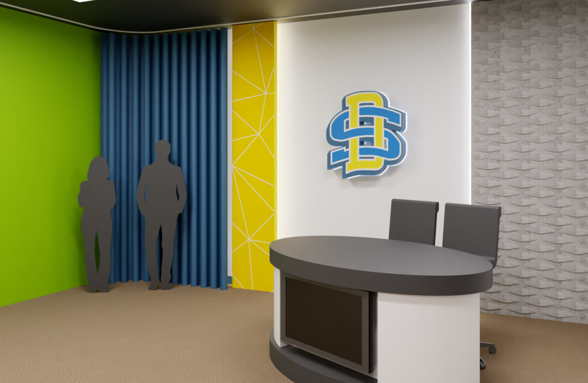
I agree with The Collegian’s editorial group and the students on the logo selection committee. The logo is not visually appealing and will not be able to carry itself as a branded icon of South Dakota State University. A logo has to be a strong graphic element that when seen, will be instantly recognized, provide an emotional message and be able to be reproduced on all formats from hats, to binders to mugs.
The New York design firm has definitely missed the mark and why would they succeed? What do they know about South Dakota, the SDSU community and its alumni? The best resources we have to deliver a product that is synonymous with SDSU – its academics, sciences and sports are the creative people in this state. Not a group of New York advertisers, who wouldn’t be able to tell you where South Dakota is even located.
Why not have a logo contest, open to all South Dakota residents? This is what Northern State University did in the early ’90s to get their current wolf logo. An artist in the community provided the winning logo, which is both graphically bold and dominant. Take the contest one step further by allowing the public to vote on their favorites. Then you know you have something everyone is proud of and committed to for the next 30 years!
Angela LandeenCollege of Pharmacy