
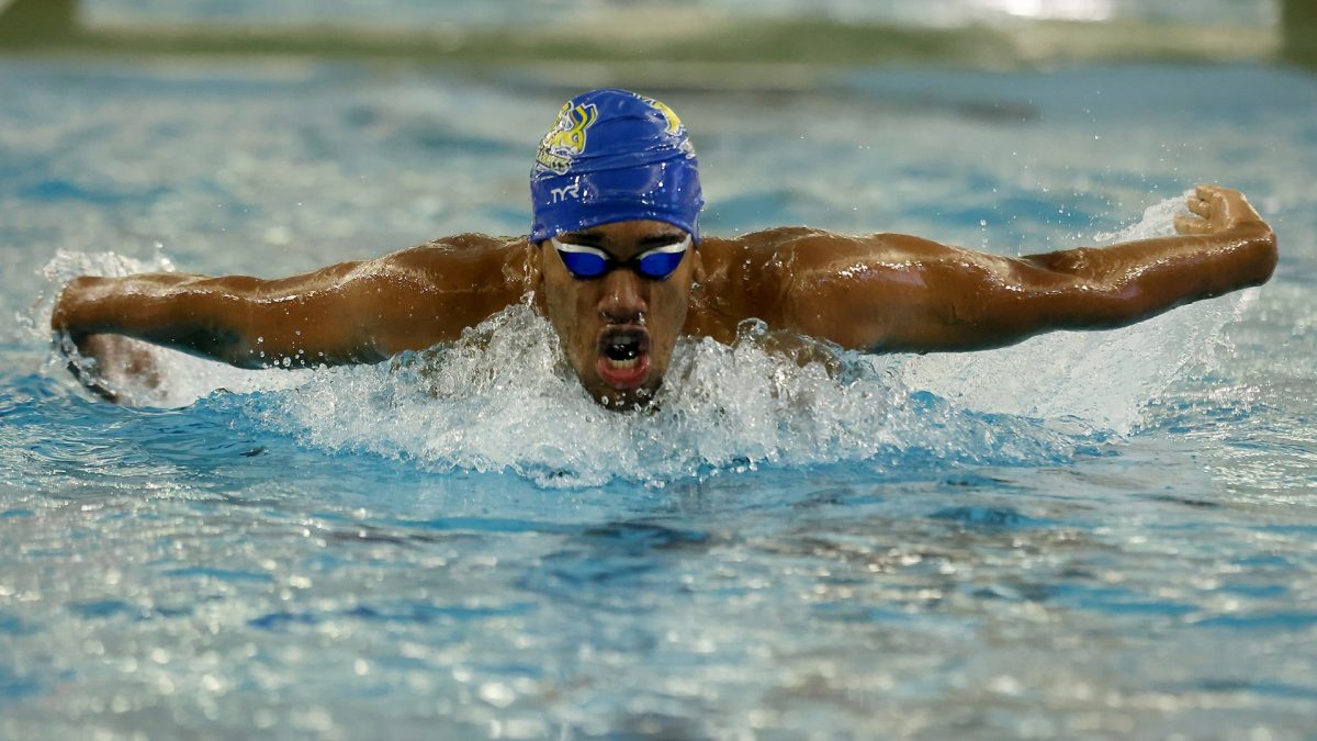


Logo firm to get ‘more direction’
February 6, 2007
Heather Mangan
The Jackrabbit logo committee will meet this week to discuss the future of SDSU’s new athletic logo, a week after a copy of the latest proposed version appeared in The Collegian.
“I don’t know if we will have any new designs in hand or not,” said University Relations Director Jenny Crickard, liaison between the committee and Phoenix Design Works of New York City.
“I was hopeful that we would, but I think (the committee) needs to give the design company more direction in what they are looking for before the new designs will be completed. That is at their request at this point,” she said in an e-mail.
Formed last fall, the logo committee had hoped to release the new logo at the NDSU/SDSU men’s basketball game on Feb. 3. But the unveiling was delayed.
Rob Peterson, associate athletic director and member of the logo committee, told The Collegian last week that committee members had asked to see different sizes and colors of the proposed logo.
Athletic Director Fred Oien said this week he is confident that the logo committee will find a new jackrabbit that accurately represents SDSU.
“We are far from where we need to be because we need to go in front of the general public,” he said.
Oien said it is still too early to determine what the final design will look like.
“I’ve been here long enough to know that things take time,” he said. “If we can’t get at least a number of people who like the logo, we’ll go back to the drawing board or stick with what we have. Timelines are artificial.”
That may be good news to those who aren’t satisfied with the latest version of the redesigned Jackrabbit logo, which appeared in a photograph in the Jan. 31 issue of The Collegian.
“If it had a farmer behind it with a rake, it would be perfect,” said Ross Hettinger, who said the latest drawing reminds him more of a cottontail rabbit than a jackrabbit.
“I couldn’t see putting this rabbit that was in the paper on a basketball court or a football field. If it’s going to be a sports mascot, it should have some attitude,” said Hettinger, a junior art education major.
At first, Hettinger was excited to hear the rabbit logo was being updated and that Phoenix Design Works was revising the logo because he was impressed with some of the firm’s other university logo designs. But his excitement faded when he saw the latest version of the Jackrabbit. He spent six hours coming up with his own versions of the logo with his idea of true jackrabbit characteristics – like dramatic eyes, defined ears and powerful legs.
He then posted his drawings on an online group at Facebook.com, a social networking Web site, because he wanted students to see different ideas. The group now has more than 400 members, and some have posted their own sketches.
Daktronics marketing associate Crystal Ehresmann, a 2003 SDSU graphic design graduate, said she was disappointed in the latest version of logo because it was “Peter Rabbit-esque.”
“I’m disappointed the university-with an excellent visual arts department and countless designer alums-didn’t look first to its home state to create a fresh image for the Jackrabbit’s burgeoning Division-I program,” she said.
But some believe working with a professional design firm was a wise choice. Eric Franzen, a junior communication studies and theatre major, likes the latest version because it’s realistic, yet aggressive.
“I don’t think it makes a difference who you use,” he said. “If you want to get your money’s worth, then go to someone to get your money’s worth.”
California school pleased with logo switch
Last year, California State University Bakersfield found itself in a similar situation as SDSU.
The Division-I university, which made the transition up this year, received a letter from Warner Brothers Studio saying CSUB’s roadrunner athletic logo was dangerously close to the cartoon Road Runner. So the university chose Phoenix Design Works of New York City – the same firm currently working on the Jackrabbit redesign – to give the university a roadrunner that was fierce, yet lovable.
“We were all very happy with the end result,” said Mike Stepanovich, director of public relations at CSUB. “They were very good to work with.”
CSUB, with an enrollment of 7,750, formed a logo committee of students, alumni, staff, and representatives from the athletic department and university relations. The athletic department’s director of marketing led the committee.
“Everyone wants to pull in different directions and it takes someone kind of firm to say ‘OK, let’s come to the task at hand’ … but at the same time make sure all voices are heard, and you’ll have a successful product,” he said.
CSUB’s roadrunner redesign took between three to four months. Stepanovich said the design firm was good about listening to the committee’s suggestions, then replying with revisions. He said the firm’s representatives worked hard and closely with their logo committee to create something that accurately represented CSUB.
“They were very good to work with. They never lost their patience,” Stepanovich said.