


You’re a Mean One, Mr. Grinch
November 30, 2021
When one looks at the Grinch films that have been made, particularly when they focus in on the Grinch’s heart, we can see what color palette was used, and in my opinion the animated version is better then the live action because the animated versions show more detail similar to that of the book.
In the book by Dr. Seuss, “How the Grinch Stole Christmas!” says that the Grinch’s heart was two sizes too small. And in the animated versions they show the size difference between that of a normal one.
The Grinch is a grouchy creature created by Dr. Seuss who tried to cancel Christmas by stealing gifts and decorations from a nearby town called Whoville on Christmas Day.
The story was published through Random House in 1957, then around the same time it was issued in a magazine through Redbook, as mentioned in an article by Zielinski’s Children’s Picturebook collection.
From then on it was produced into different films and musicals.
“Dr. Seuss was meticulous about color selection. He created specially numbered color charts and intricate color callouts to precisely accomplish his vision for each book,” the Art of Dr. Seuss Collection said.
Dr. Seuss’ sense of color helped move the storyline ahead via illustrations.
In the book, we note that the Grinch’s story was written and drawn in black and white. However, it also included the color red and pink to highlight some features the author wanted to make pop more. Those items included the Grinch’s outfit, his eyes, a sack that was used to collect toys, the houses in Whoville and even some words.
The color scheme was presented differently when it was made into an animation film.
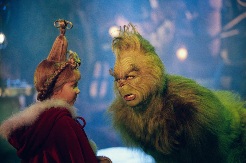
The first film was in 1966. It was an animated TV film that was directed by Chuck Jones and narrated by Boris Karloff as the Grinch. A live action adaptation was made in 2000 and directed by Ron Howard. The most recent adaptation was animated in 2018 and was directed by Scott Mosier and Yarrow Cheney.
The Grinch was made green by the original director, Chuck Jones, because of the ugly rental cars he had driven, as mentioned by Maria Vultaaggio in IBTimes.
Even then, according to Kendra Cherry, who wrote “The Color Psychology of Green,” color impacts our moods and emotions. The color “green often symbolizes nature and the natural world,” it says in her book. Green also represents tranquility and luck in addition to envy or jealousy.
All of the films portrayed a wide range of colors, which seems to energize someone into an uplifting mood.
In my opinion, if we were to compare their color, the films done in 1966 and in 2018 both seem brighter than the 2000 film.
On Rotten Tomatoes, the 1966 film was rated 100% in reviews, and its audience ratings scored 96%. Some mention that the story was familiar and it was a good-hearted cartoon, as it shows emotions by the characters’ expression and voice.
The 2018 animated film was rated 59% and its audience ratings scored 51%.
As for the live action film in 2000, on Rotten Tomatoes, the film was rated 49% in reviews and its audience rating scored a 56%. Some said that it was “clamorous” or “kind of desperate.”
Perhaps because people have the 1966 film to compare it to, it doesn’t seem as bright and as uplifting. But to me it was still good to watch. It was quite a family show.